

Rolex Oyster Perpetual Wall Clock: Tiffany Blue and Modern Colour Trends

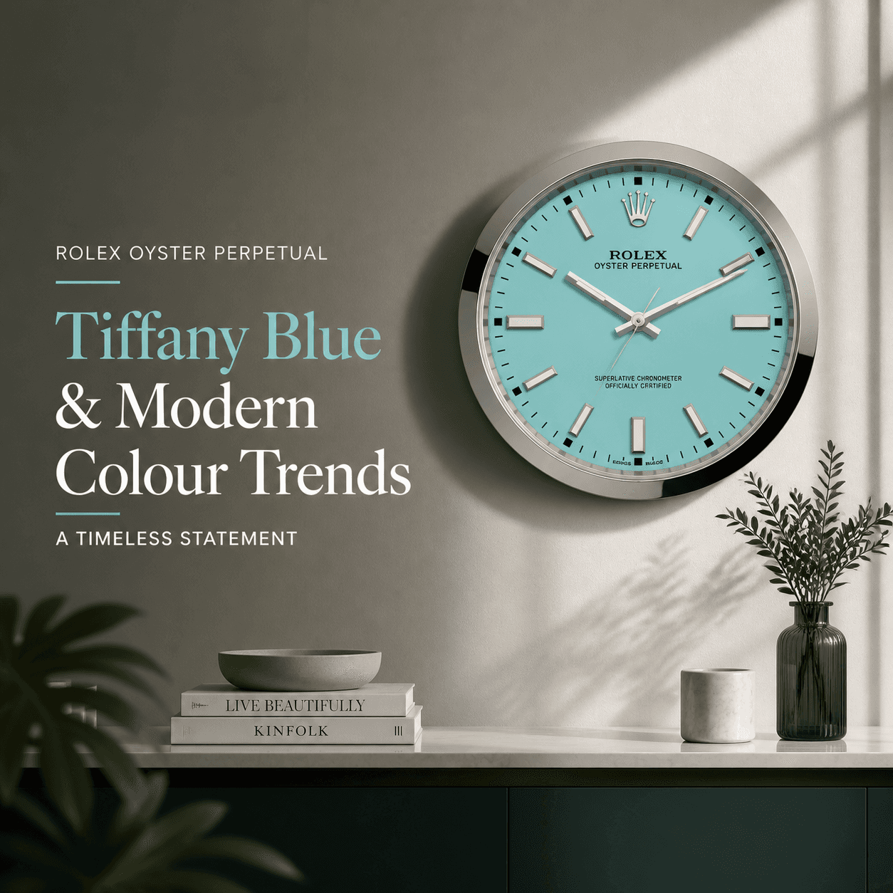
If you have spent even five minutes on design Instagram lately, you have probably seen it: that bright, clean, slightly playful blue that makes a room feel instantly more modern. People call it “Tiffany Blue” as shorthand, even when the exact shade varies from brand to brand. And when that colour shows up on something unexpected, like a Rolex Oyster Perpetual wall clock, it hits a sweet spot between luxury culture and contemporary interiors.
This is the interesting part. A wall clock is usually a background object, something we glance at and forget. But a Rolex-inspired Oyster Perpetual wall clock in that signature blue turns into a statement piece, the kind that quietly changes how a room feels without needing a whole redesign.
Why Tiffany Blue Feels So Modern Right Now
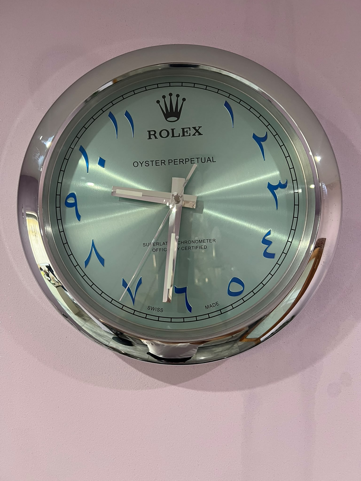
OYSTER PERPETUAL Wall Clock IN SILVER Crome stainless steel with black face.
Tiffany Blue works because it sits in a rare middle ground. It is bold enough to read as a “colour choice,” but soft enough to live with every day. It brings energy without the visual noise you get from neon tones, and it stays crisp compared to many pastels that can look dusty in certain lighting.
In modern interiors, colour trends are leaning toward what designers often call “clean confidence.” Think warm whites, natural wood, matte black accents, and then one pop of colour that feels intentional. Tiffany Blue slides into that role perfectly. It looks premium, it photographs well, and it plays nicely with both minimalist and more curated, collector-style spaces.
What Makes The Rolex Oyster Perpetual Look So Iconic
The Oyster Perpetual aesthetic is basically a masterclass in restrained design. It is not loud, but it is instantly recognizable. Even people who are not “watch people” tend to recognize the silhouette cues: the clean dial, the balanced markers, the sporty-elegant vibe, and the overall feeling of precision.
When this design language is translated into a wall clock, it keeps the same effect. You get structure, symmetry, and a sense of “this belongs here,” even if the rest of the room is simple.
A Tiffany Blue dial pushes that classic feel into the present. It keeps the heritage vibe, but the colour says modern, playful, and editorial, like something you would expect in a well-designed office, studio, or living space.
How A Tiffany Blue Wall Clock Changes A Room
Most décor upgrades require commitment: paint, furniture, lighting, rugs. A wall clock is easier. It is one item, one placement, and it can still create a “designed” moment on an otherwise plain wall.
A Rolex wall clock tends to do three things visually.
First, it brightens a space without increasing clutter. Second, it creates a focal point that feels intentional rather than decorative-for-the-sake-of-it. Third, it adds a subtle luxury reference without needing logos everywhere or heavy, traditional styling.
The result is a room that feels newer and more put-together, even if nothing else changes.
The Colour Pairings That Work Best (Without Overthinking It)
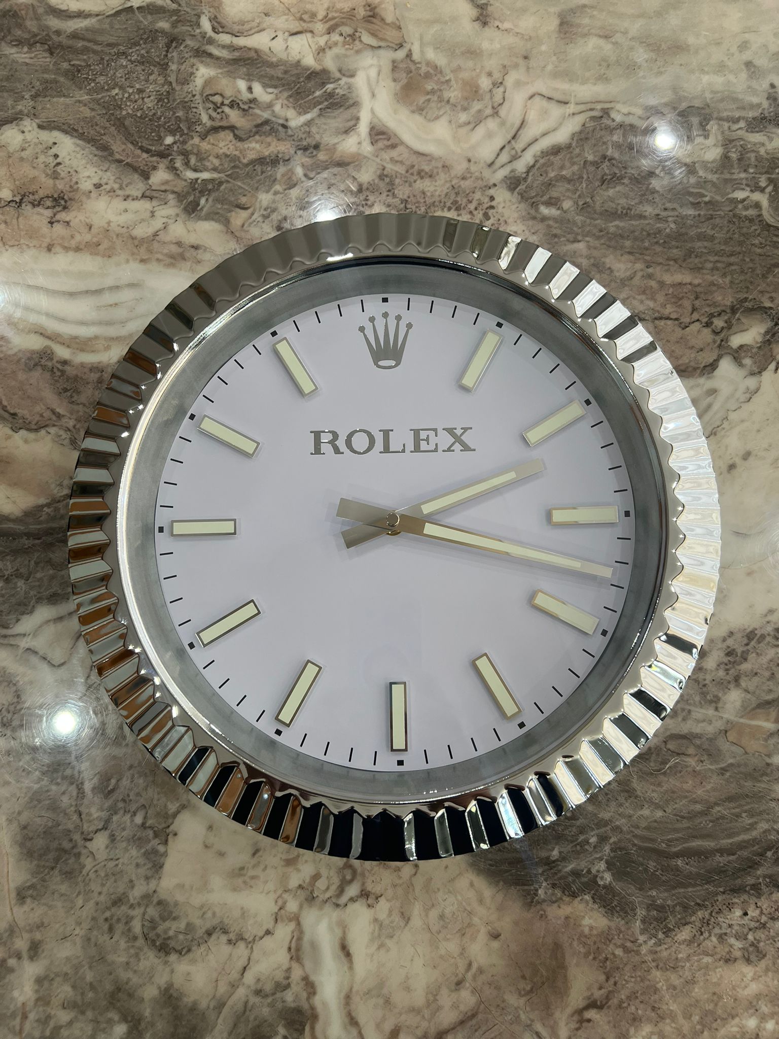
Luxury Rolex Oyster Wall Clock Steel and Platinum Silver
If you want the clock to look like it belongs, the surrounding palette matters. Tiffany Blue is surprisingly flexible, but it shines most when it has contrast or calm neutrals around it.
Here are a few combinations that consistently work in real rooms:
- White + Light Oak + Tiffany Blue for a bright, Scandinavian-style look.
- Charcoal Grey + Black Accents + Tiffany Blue for a sharper, more masculine modern vibe.
- Cream + Brass + Tiffany Blue for a softer luxury look that feels warm and upscale.
- Concrete Tones + Chrome + Tiffany Blue for a contemporary, almost gallery-like finish.
- Beige Neutrals + Tiffany Blue for a subtle and elegant aesthetic that can be easily achieved by decorating with neutrals.
You do not need to match the blue to anything else. In fact, it usually looks better when it is the only strong colour note in the space.
Where This Clock Looks Best In A Home Or Office
Placement is where a wall clock goes from “nice object” to “design feature.” A Rolex Oyster Perpetual wall clock in Tiffany Blue performs best in spots where it can be seen clearly and not compete with busy art or shelves.
In living rooms, it looks great above a sideboard, near a reading corner, or on a clean wall that needs one strong element. In an office, it can sit behind the desk for a Zoom-ready backdrop, or on a side wall where it adds personality without distracting you. There are specific Rolex desk top clock only for desks.
Kitchens can also work, especially modern ones with white cabinets or darker stone counters. The blue can add a bit of freshness that keeps the space from feeling too monochrome.
Tiffany Blue And The Bigger Shift In Luxury Design

Rolex Daytona Wall Clock Tiffany Blue Black | Blue Wall Clock
What is happening right now is bigger than one colour. Luxury aesthetics are shifting away from only traditional signals, like heavy wood, gold everywhere, and formal styling. Modern luxury is cleaner. It is more about materials, proportion, and one or two “perfect” objects.
That is why items like a Tiffany Blue Rolex-inspired wall clock are getting attention. They fit the modern collector mindset: fewer pieces, better impact. It is the same logic behind buying one excellent chair instead of filling a room with furniture that is just “fine.”
And if you are someone who likes watches, the appeal is even more obvious. A wall clock becomes a way to bring that design obsession into a space where you actually spend time working, hosting, and living.
How To Style It Like It Was Always Meant To Be There
If you want the clock to look intentional, treat it like you would treat artwork. Give it breathing room. Avoid placing it in a crowded collage wall unless the rest of the wall is carefully planned.
A few simple styling moves go a long way. Place it above a console with one tall vase and one stack of books. Or pair it with a single framed print that uses a hint of blue, not as a match, but as a subtle echo. If your room already has black accents, like a floor lamp or chair legs, the clock will feel instantly integrated.
Lighting matters too. Tiffany Blue looks different in warm light versus daylight. If your space is very warm-lit at night, the blue will lean slightly greener. In daylight, it tends to look cleaner and brighter. Neither is bad, but it is worth knowing so you are not surprised.
What To Look For When Buying A Rolex Oyster Perpetual Wall Clock
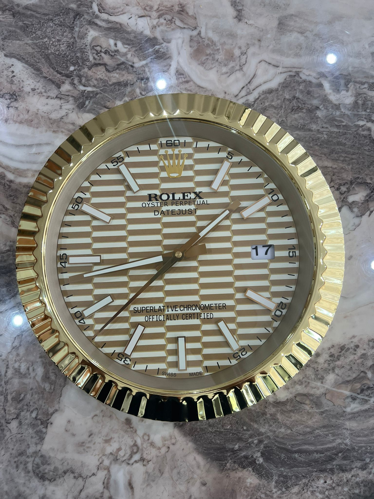
Luxury Rolex Oyster Wall Clock Steel and Yellow Gold
Not all wall clocks in this style look premium up close. Some get the proportions wrong. Some use low-quality printing that looks flat. Others have cheap hands that bend or reflect light awkwardly.
If you are choosing one for a modern space, pay attention to the details that make it feel “real” as décor: crisp dial printing, clean indices, balanced hand lengths, and a case finish that does not look toy-like. Quiet sweeping movement can also make a difference, especially for bedrooms and offices where constant ticking becomes annoying.
The best versions feel like design objects first, novelty items second.
The Bottom Line On Tiffany Blue And Modern Colour Trends
Tiffany Blue is not just a trend for the sake of it. It is a colour that communicates modern luxury in a simple, instantly readable way. And when you combine it with a design language as iconic as the Oyster Perpetual, you get something that feels both familiar and fresh.
If your home leans minimalist, it adds a perfect pop. If your space is already curated, it fits right into that collector energy. Either way, it is one of those pieces that makes people look twice, then ask where you got it.
Frequently Asked Questions
What Makes Tiffany Blue So Popular In Modern Interiors?
It feels clean, premium, and energetic without being loud. It pairs easily with neutrals like white, oak, black, and grey, so it adds personality while still looking calm and intentional.
Will A Tiffany Blue Wall Clock Clash With My Existing Decor?
Usually not. If your room has a neutral base, Tiffany Blue works as a single accent colour. Keep surrounding décor simple, and avoid adding multiple competing bright colours nearby.
Is A Rolex Oyster Perpetual Wall Clock Suitable For Office Spaces?
Yes. It creates a polished focal point, looks great on video calls, and adds a subtle luxury reference without overwhelming the room. It works especially well with modern desks and clean walls.
How Do I Choose The Right Size For My Wall?
Measure the wall area first. For most living rooms and offices, a larger statement size looks best on open walls, while medium sizes suit tighter areas like kitchens or hallways.
Should I Match The Clock Colour With Other Accessories?
You do not have to. One Tiffany Blue piece often looks more refined than trying to match everything. If you want cohesion, use tiny hints of blue in books, art, or ceramics.
Do These Clocks Look Better In Warm Light Or Daylight?
Both can work. Daylight keeps the blue crisp and bright, while warm lighting can make it look slightly greener and softer. Test placement where it gets your typical lighting.
A Smooth Call To Action For Luxury Wall Clock Buyers
We all have that one wall that feels a little empty, even in an otherwise beautiful space. If we want a single upgrade that adds polish, personality, and a modern luxury edge, our next move is simple: choose a Luxury Wall Clock that looks intentional the moment it goes up. Let’s make time part of the décor, not an afterthought.