

White Vs. Black Omega Speedmaster Style Wall Clock: Which One Looks Better?

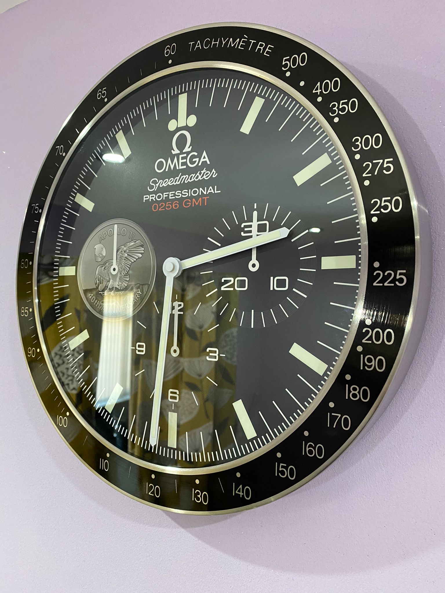
Choosing an omega clock wall design is less straightforward than it first appears. At a glance, the difference between a white and black Speedmaster-style wall clock seems to be little more than dial colour. In practice, that colour changes how the entire clock interacts with a room, from contrast and readability to the way its silver detailing and chronograph-inspired layout are perceived.
The same principle applies to watches. A black dial tends to feel traditional, grounded and visually compact, while a white dial can appear brighter, cleaner and more noticeable. Watch enthusiasts have debated this exact contrast in the Speedmaster world, with opinions often split between the historical character of black and the more contemporary presence of white.
For a wall clock, however, the decision has another layer: you are not wearing it on your wrist. You are placing it into a room where furniture, wall colour, lighting and surrounding decoration all influence how the dial looks.
What Makes The Speedmaster Style So Effective?
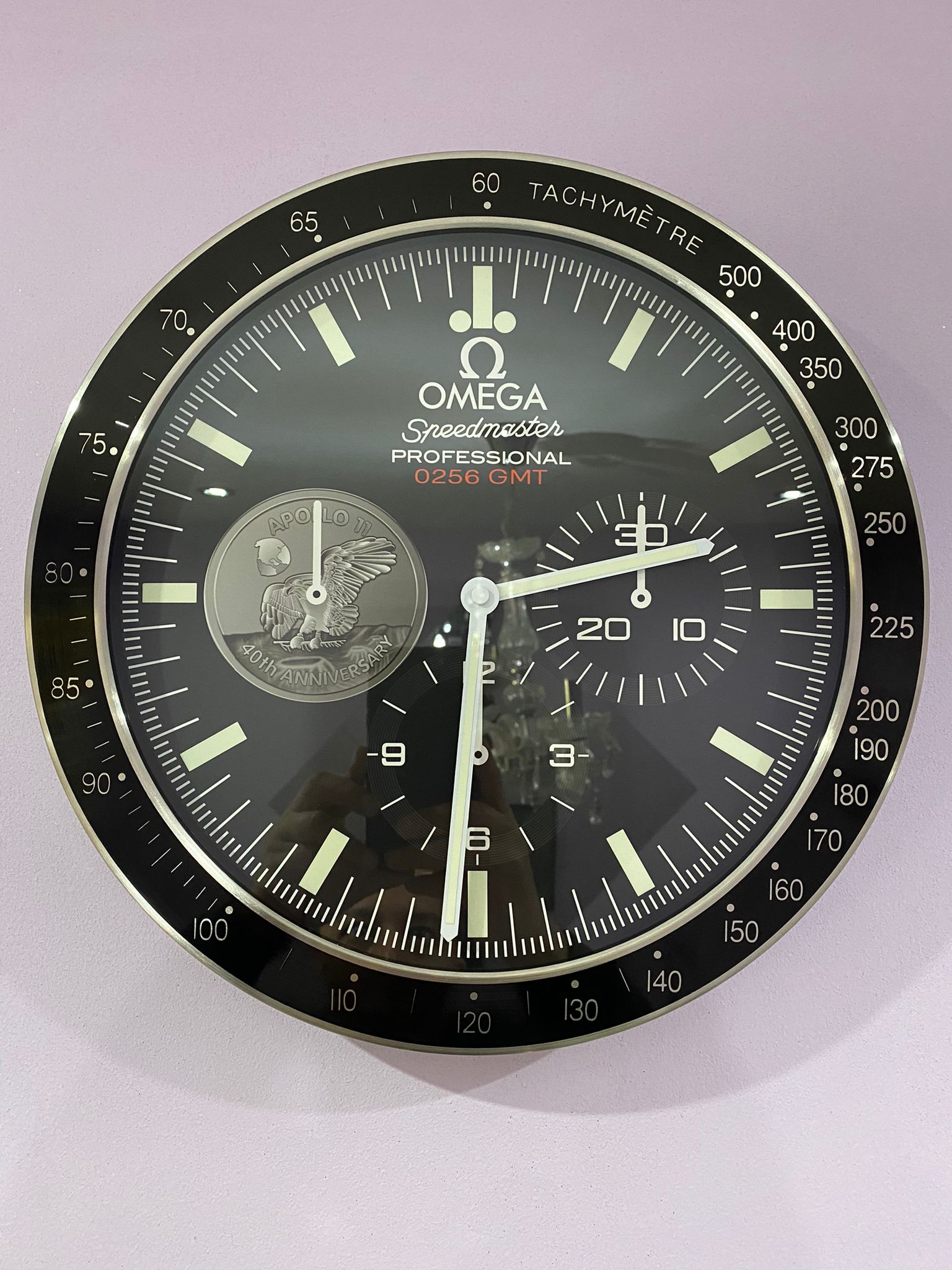
OMEGA Wall Clock Series
The appeal of a Speedmaster-inspired clock comes from its familiar visual language. Multiple sub-dials, a strong outer scale, contrasting hands and a circular case create the impression of a precision instrument rather than an ordinary household clock.
That makes the design particularly useful for interiors where the clock needs to feel intentional. Instead of simply filling an empty section of wall, it can work almost like a piece of automotive or horological décor.
The important point is not whether one colour is objectively better. It is whether the visual character of that colour makes sense in the room.
That distinction becomes particularly important when comparing an omega wall clock with lighter and darker interior schemes.
Why The White Omega Style Clock Feels Brighter
A white dial naturally reflects more of the available light, which gives the clock a lighter visual presence. Against a darker wall, the effect becomes even stronger because the dial immediately separates itself from the background.
This is one reason the white version can work particularly well in contemporary offices, minimalist living rooms and spaces built around neutral colours. Silver or metallic-looking details also become easier to notice because they sit against a bright background.
The same effect can be seen in wristwatches. Recent discussion around the white-dial Speedmaster has focused on how the lighter surface changes the personality of the familiar design. Fratello’s comparison describes the white version as visually more striking, while still recognising the traditional appeal of the black model.
For someone looking for a white omega watch aesthetic in wall décor, that distinction matters. White does not necessarily make the design less sophisticated. Instead, it shifts the emphasis from heritage and restraint towards brightness and visual clarity.
Why The Black Omega Style Clock Feels More Traditional
A black dial creates almost the opposite effect. The darker surface absorbs more visual attention into the centre of the clock, while white, silver or metallic markings create stronger contrast.
That makes a black omega black watch style particularly easy to integrate into rooms with dark furniture, industrial materials, wood finishes or stronger accent colours.
There is also a familiarity to the black Speedmaster aesthetic. The black-dial Moonwatch has long been associated with the traditional Speedmaster identity, which is why enthusiasts who value the classic appearance often gravitate towards it. In Fratello’s white-versus-black comparison, the argument for black centred heavily on its established tool-watch character and straightforward visual balance.
That idea translates surprisingly well to a wall clock. A black clock tends to recede slightly into the overall interior while still providing enough contrast to remain readable.
White Vs. Black: Which Looks Better On Your Wall?
The simplest way to decide is to stop thinking about the clock in isolation.
Think about the wall first.
If your wall is dark grey, charcoal, navy or another deep colour, a white dial will usually create more separation. The clock becomes an obvious focal point without requiring additional decoration.
If your wall is white or very light, the black version generally creates stronger definition. The darker face gives the room a visual anchor and prevents the clock from blending into the background.
Furniture matters too. Light oak, pale flooring and neutral upholstery often work naturally with a white dial. Dark wood, leather furniture, black shelving and industrial metal details can make the black version feel more coherent.
This is broadly consistent with the wider principle behind choosing black or white watch dials: white tends to create a lighter, cleaner impression, while black provides stronger definition and depth.
Which One Is Better For A Classic Interior?
OMEGA Series,Black Wall Clock
If your priority is a traditional look, the black version has the advantage.
A black omega classic watch aesthetic naturally connects with the history of the Speedmaster design. It feels restrained rather than decorative, which can be useful in a study, home office, library or room containing traditional furniture.
This does not mean white cannot work in a classic setting. A white dial can actually provide an interesting contrast against darker wood and vintage-inspired furniture. But the result feels more like a classic design interpreted through a contemporary lens.
That distinction is useful when considering omega classic watches men often prefer. The attraction is usually not simply the colour; it is the combination of recognisable proportions, contrast and understated functionality.
Which One Is Better For A Modern Interior?
For a modern room, the answer becomes less predictable.
White works exceptionally well when the room already has a clean, bright palette. It can reinforce a minimalist approach and make the clock feel like part of the architecture.
Black works better when the room relies on contrast. Think black-framed windows, dark shelving, leather seating or monochrome artwork.
A useful rule is simple: use white when you want the clock to brighten the wall; use black when you want the clock to define it.
That principle is more reliable than choosing a colour simply because it looks good in a product photograph.
Does Size Change The Colour Choice?
Yes. Size can change how dominant the dial feels.
A larger wall clock naturally occupies more visual space, so the dial colour becomes more important. A bright white face can become a strong focal point, particularly on a dark wall. A black face of the same size may feel more visually contained.
With a smaller clock, the difference is usually less dramatic because there is less dial surface competing with the rest of the room.
This is why choosing the right omega clock wall design should involve both colour and placement. A colour that works beautifully at one size may feel too dominant or too subtle at another.
What About Silver Details?
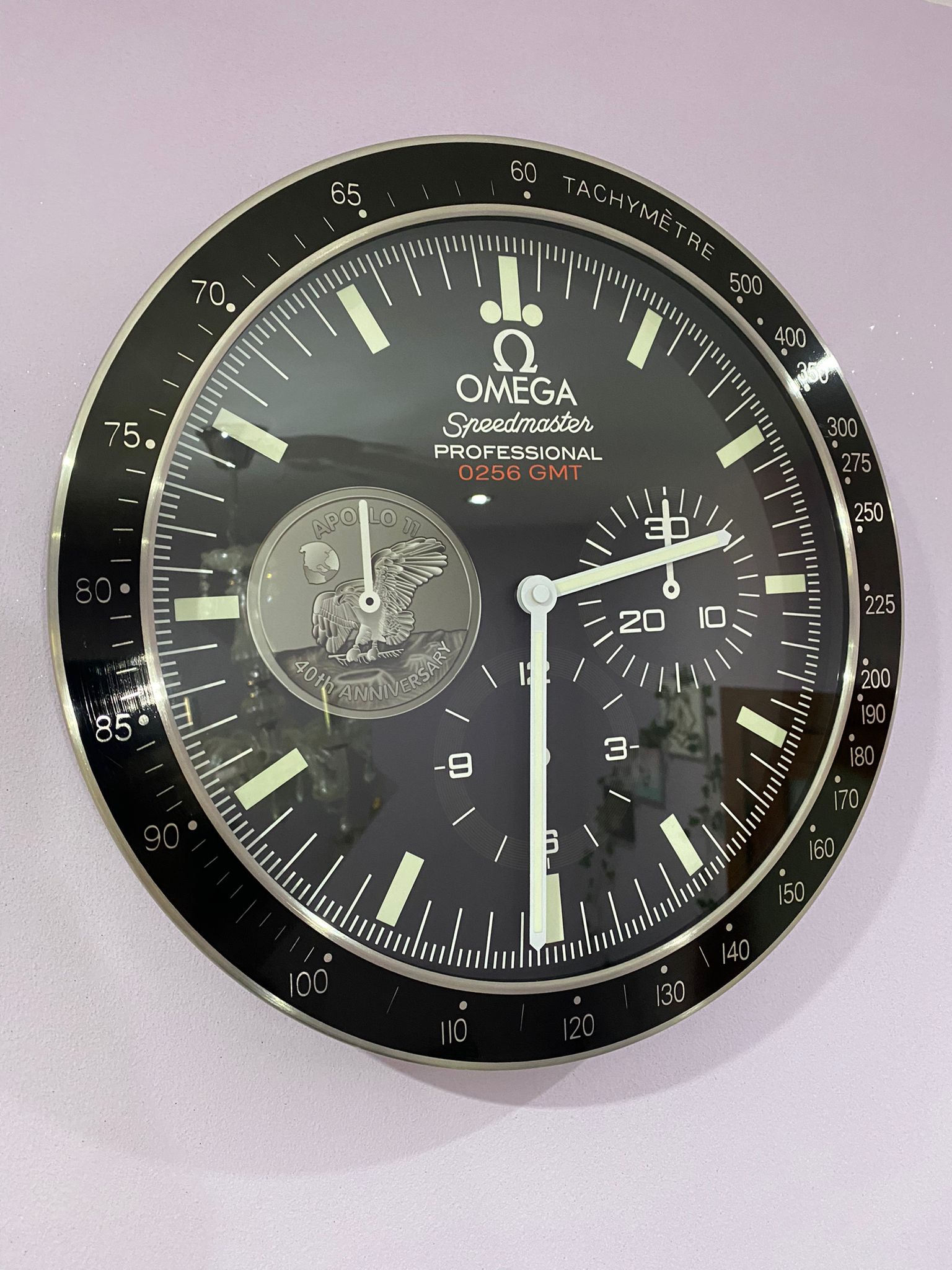
OMEGA Series,Black Wall Clock
Silver is particularly interesting because it sits between the two choices.
Against white, silver details can create a refined, low-contrast appearance. The overall result is lighter and more understated.
Against black, the same silver elements become much more prominent. The contrast makes the hands, markings and case visually stronger.
For this reason, people searching for an omega silver watch aesthetic may actually find that the black-dial wall clock provides more of the metallic impact they are looking for.
It is less about the amount of silver used and more about the surface behind it.
White Or Black: Which Should You Choose?
If I had to reduce the decision to one principle, I would not ask which colour looks better. I would ask which colour solves the room’s visual problem.
Choose white if the wall needs brightness, contrast or a cleaner focal point.
Choose black if the room needs definition, depth or a more traditional instrument-like appearance.
There is no universal winner. Even the debate around the actual Speedmaster shows why. Fratello’s community comparison ultimately gave the traditional black Moonwatch a narrow victory, demonstrating how close the preference can be when both designs share the same underlying identity.
For an omega clock wall installation, the same logic applies. The best choice is the one that feels naturally connected to everything around it.
Frequently Asked Questions
Is A White Or Black Omega Style Wall Clock Better?
Neither is universally better. White creates a brighter, cleaner focal point, while black offers stronger contrast and a more traditional appearance. The best option depends on your wall colour, furniture and overall interior style.
Does A Black Wall Clock Look Better On A White Wall?
Usually, yes. A black dial creates immediate contrast against a white wall, making the clock easier to notice. It can also provide visual balance when the surrounding furniture and décor use darker accents.
Is A White Wall Clock Suitable For Dark Walls?
Yes. A white dial can work particularly well against charcoal, navy, dark green or other deep wall colours because the contrast makes the clock stand out without requiring additional wall decoration.
What Makes A Speedmaster Style Clock Different From A Normal Wall Clock?
The Speedmaster-inspired design uses chronograph-style sub-dials, strong circular detailing and a precision-instrument appearance. This gives it a more distinctive visual character than a simple three-hand wall clock.
Should I Choose A Black Or White Clock For A Modern Home?
Consider the room’s existing palette. White generally suits bright, minimalist interiors, while black works well with monochrome schemes, dark furniture, metal accents and industrial-inspired spaces.
Can A Speedmaster Style Wall Clock Work In An Office?
Yes. Its structured dial and instrument-inspired appearance can suit home offices, studios and professional spaces. The black version usually feels more understated, while white can provide a brighter decorative focal point.
A Better Way To Choose Your Wall Clock
At Luxury Wall Clock, we believe the right wall clock should make sense within the room rather than simply look impressive on a product page. That means considering the wall, lighting, furniture, size and the atmosphere you want to create before choosing a colour.
If the room already feels dark and heavy, a white dial may provide the balance it needs. If the room feels visually flat, a black dial can introduce definition.
In the end, the best omega clock wall design is not necessarily the one that wins a black-versus-white debate. It is the one you can look at every day and still feel that it belongs exactly where you placed it.
We prefer that kind of choice at Luxury Wall Clock: considered, practical and based on how a piece will actually live in your space rather than on a passing trend.