

Does The D-Blue Wall Clock Have A Smooth Blue-To-Black Gradient Like The Genuine Deepsea Dial?

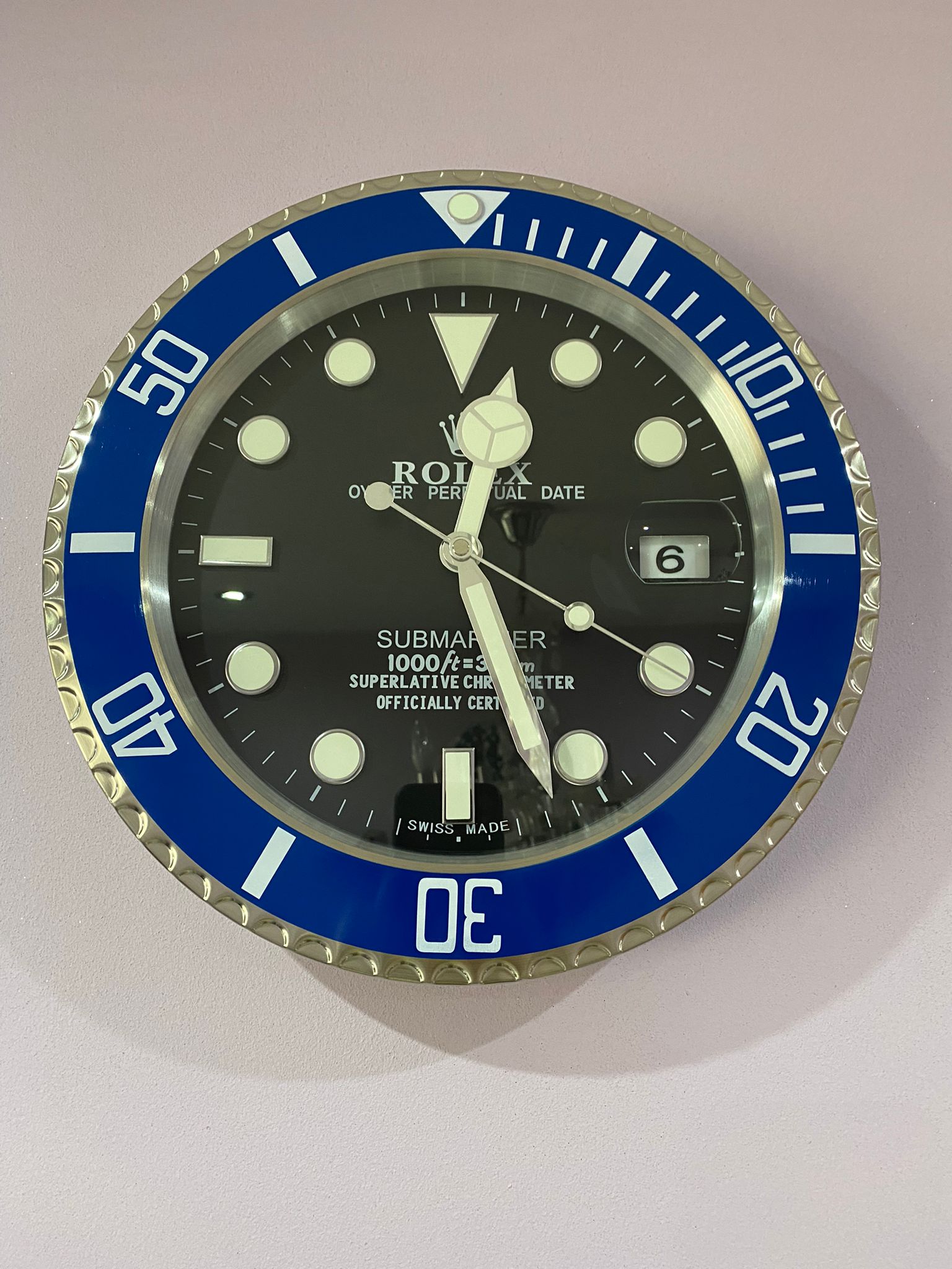
If you are comparing the Rolex wall clock price with other luxury wall clocks, the dial is one of the first details worth examining. The D-Blue style is especially interesting because its appeal comes less from simply being blue and more from the transition between blue and black. That gradient is what gives the design its connection to the Rolex Deepsea and makes a D-Blue Rolex wall clock look considerably more distinctive than an ordinary blue clock.
The short answer is yes: a well-made D-Blue wall clock should aim to reproduce a smooth blue-to-black transition similar to the visual character of the genuine Deepsea D-Blue dial. However, it is important to understand that a wall clock is not the same product as the Rolex Deepsea watch itself. The quality of the gradient, printing, finish and overall construction can vary considerably between clocks.
What Makes The Genuine Deepsea D-Blue Dial Different?
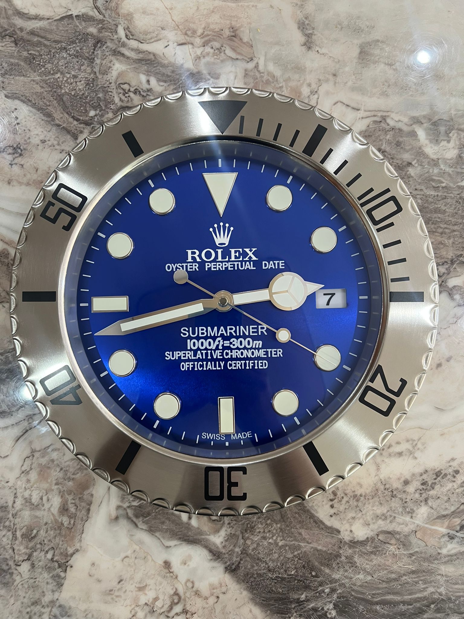
Luxury Rolex Submariner Wall Clock with Blue face
The genuine Deepsea provides the reference point. Rolex describes the D-Blue dial as a two-colour gradient moving from brilliant blue to black, created in connection with the story of James Cameron’s historic deep-sea dive.
You can see the manufacturer’s description and current model details on the official Rolex Deepsea D-Blue page. The important point for anyone evaluating a Rolex clock for wall use is that the gradient is not simply a blue upper half followed by a black lower half.
It is a gradual visual transition. The blue becomes progressively darker before disappearing into black. That distinction matters because a harsh dividing line immediately makes a wall clock look more like a printed graphic than a carefully considered luxury clock.
Hodinkee’s original hands-on coverage also describes the D-Blue as a gradient dial that moves from blue to black. Its photographs are useful when comparing the appearance of the genuine watch with a Rolex clock wall design.
Should A D-Blue Wall Clock Have A Completely Identical Gradient?
Not necessarily. This is where expectations need to be realistic.
A Rolex wall clocks design inspired by the Deepsea can reproduce the overall colour concept without reproducing every characteristic of the original watch dial. The physical size is different, the printing or finishing process may be different, and the lighting in a room can change how the blue appears.
What you should look for is consistency. The blue should not suddenly stop halfway across the dial. Instead, the transition should feel continuous when viewed from normal room distance.
This is also why photographs alone can sometimes be misleading. A heavily edited product image can make almost any gradient appear smoother than it really is. If possible, look for several product photographs taken under different lighting conditions before judging a luxury wall clock.
How Smooth Should The Blue-To-Black Transition Be?
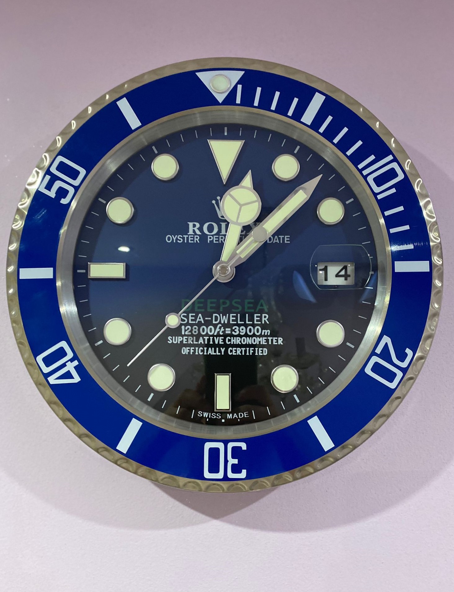
luxury wall clock | Rolex Dweller deep sea blue bezel with blue face
Think of the gradient as a spectrum rather than two separate colours.
At the top, the dial should have enough blue presence to immediately communicate the D-Blue aesthetic. As your eye moves downward, the colour should become deeper and darker until it reaches black.
A useful comparison is a sunset photograph. You do not expect the sky to change from bright blue to black at one exact line. There are intermediate shades between the two. The same principle makes a D-Blue-inspired luxury clock look more convincing.
If you are comparing the Rolex wall clock price, this is one of the details worth considering rather than focusing only on diameter or frame material. A cheaper clock with a convincing gradient may look better on a wall than a more expensive model with a flat, poorly printed dial.
What Should You Check Besides The Gradient?
The gradient is important, but it should not be evaluated in isolation.
First, look at the relationship between the gradient and the markers. The hour markers and hands should remain easy to read against both the blue and black sections. If the lower portion becomes too dark and the hands disappear into it, the visual effect may be attractive in a photograph but less practical in everyday use.
Second, examine the printing. Text and minute markings should appear reasonably sharp rather than fuzzy around the edges.
Third, consider the movement. A decorative Rolex watch clock is still a wall clock, so dependable timekeeping and an appropriate movement matter. If the clock is intended for a bedroom, office or quiet living space, noise from the mechanism can also affect the experience.
Finally, consider the physical finish. A convincing gradient cannot compensate for a poorly finished case or an inconsistent surface.
Does The D-Blue Style Work As A Luxury Wall Clock?
Yes, largely because the colour scheme has enough contrast to work at a larger scale.
The combination of deep blue, black and contrasting markers can create a strong focal point without requiring an overly complicated design. This makes the D-Blue concept suitable for offices, studies, lounges, watch rooms and contemporary interiors.
For comparison, you can look at examples marketed as D-Blue dealer display wall clocks and assess how the colour transition is handled in a larger wall-clock format.
The key is proportion. On a wristwatch, the D-Blue dial is relatively small and surrounded by a substantial case and bezel. On a wall clock, the dial occupies much more visual space. That means imperfections in the gradient can become easier to notice.
What Does The Rolex Wall Clock Price Actually Tell You?
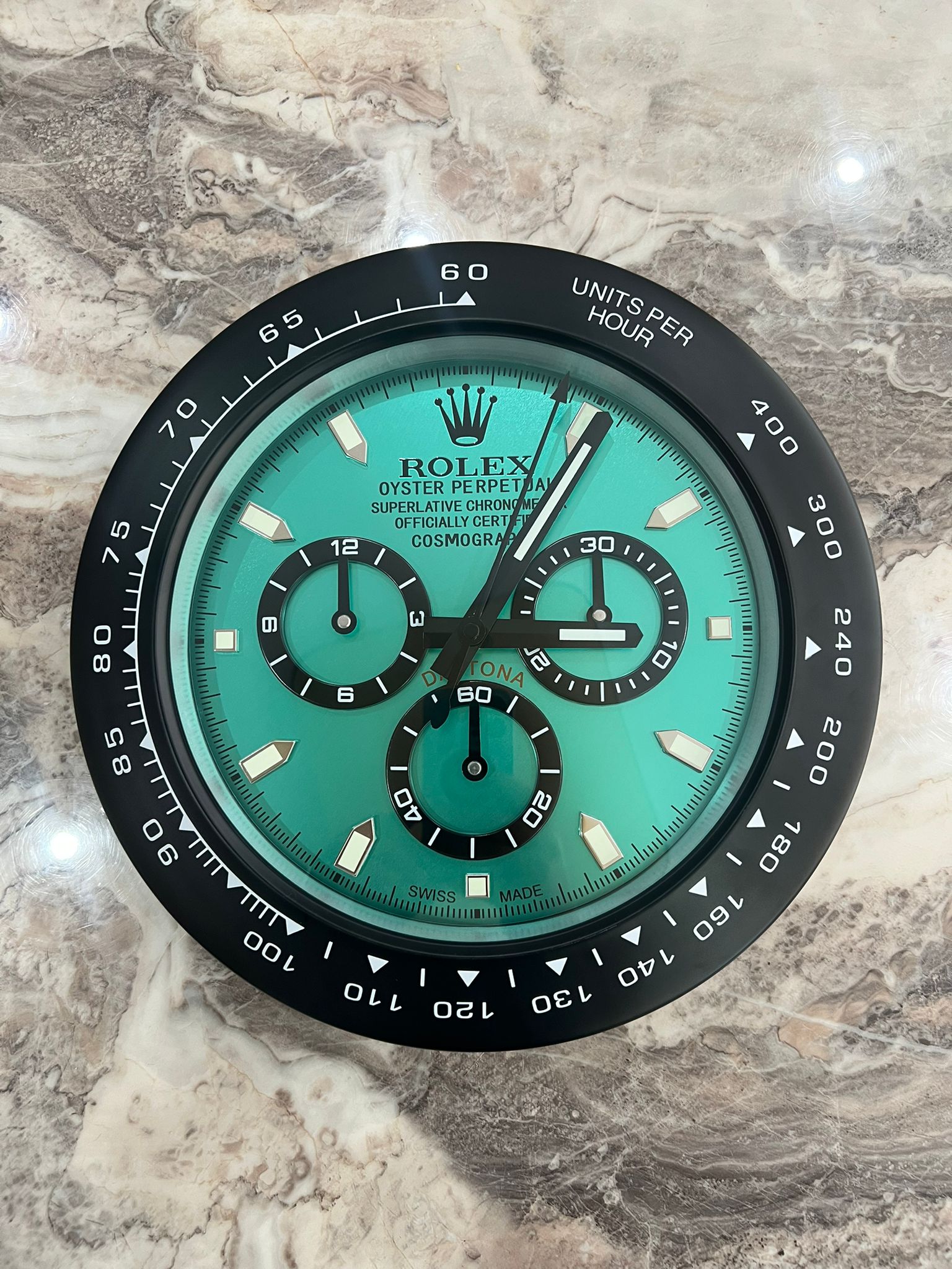
Rolex Daytona Wall Clock Tiffany Blue Black | Blue Wall Clock
The Rolex wall clock price should be treated as one part of the buying decision rather than proof of quality.
A higher price can reflect larger dimensions, better materials, improved finishing, a quieter movement, limited production or the scarcity of a particular display piece. It does not automatically mean that the blue-to-black gradient is better.
This is particularly relevant because the market contains different types of Rolex-inspired and dealer-display-style clocks. Some are decorative interpretations, while others are presented as collectible display pieces. Their prices can therefore be very different even when the overall visual design looks similar.
If authenticity is important, check exactly what the seller is offering and how it describes the item’s origin. Do not assume that a clock carrying a familiar watch design is an officially manufactured consumer product.
For collectors researching Rolex wall clock uk listings, this distinction is particularly useful. Compare the construction, dimensions, movement and provenance instead of using the Rolex wall clock price as the only quality indicator.
How Can You Compare The Gradient Before Buying?
Start with the official Deepsea reference. The current Rolex page identifies the D-Blue dial and describes the transition from brilliant blue to black.
Then compare that reference with the actual clock photographs. You can also use detailed horological photography such as Hodinkee’s hands-on photographs of the Rolex Deepsea D-Blue to understand how the colour behaves under real lighting.
Look specifically at three things: whether the transition is continuous, whether the darkest section actually reaches black, and whether the colour remains balanced around the dial.
This approach is more useful than simply searching for the best wall clocks and choosing whichever listing has the most attractive product photograph.
Is A Perfect Gradient Necessary?
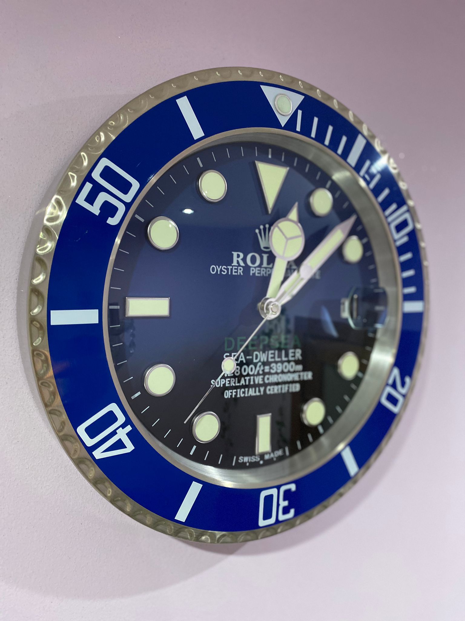
luxury wall clock | Rolex Dweller deep sea blue bezel with blue faceluxury wall clock | Rolex Dweller deep sea blue bezel with blue face
No. A good D-Blue wall clock does not need to be an exact reproduction of the watch dial to look successful.
What matters is whether the design captures the principle that makes the original distinctive: a controlled movement from blue into black rather than a basic two-tone split.
If the gradient looks natural, the dial remains legible, and the surrounding construction is consistent, the clock can work very well as a decorative piece.
That is ultimately what makes a luxury clock wall design successful. The object needs to look considered from across the room and still hold up when someone stands close enough to inspect the details.
Final Thoughts
So, does the D-Blue wall clock have a smooth blue-to-black gradient like the genuine Deepsea dial? A well-executed version should, at least in terms of the overall visual concept. The genuine Rolex Deepsea uses a deliberate two-colour gradient from blue to black, and that transition is central to the identity of the D-Blue design.
But the Rolex wall clock price should never be the only thing you use to judge whether a particular clock gets the effect right. Look at the actual dial, the smoothness of the colour transition, readability, movement and construction.
In the end, the most convincing Rolex clocks are not necessarily the ones with the most dramatic product photography. They are the ones where the design still looks balanced when you step back, and where the small details continue to make sense when you move closer.
That is a useful principle for choosing any luxury clock: good design does not need to shout. It simply needs to remain convincing from every angle.
Frequently Asked Questions
Does The D-Blue Wall Clock Really Have A Blue-To-Black Gradient?
A quality D-Blue style wall clock should reproduce the Deepsea-inspired transition from blue into black. However, the exact smoothness depends on the clock’s printing, finishing process, lighting and overall manufacturing quality.
What Makes The Deepsea D-Blue Dial Special?
The genuine Deepsea D-Blue dial uses a two-colour gradient moving from brilliant blue to black. Rolex created the design to commemorate James Cameron’s historic solo dive to the Mariana Trench.
Does A Higher Rolex Wall Clock Price Mean Better Quality?
Not automatically. Price can reflect materials, size, movement, finishing, rarity and provenance. Buyers should inspect the actual gradient, construction and mechanism rather than assuming that higher price guarantees better quality.
How Can I Tell If A D-Blue Gradient Looks Good?
Look for a gentle transition, not a clear horizontal dividing line. The blue should gradually darken toward black while the markings and hands remain legible enough to read comfortably.
Is A D-Blue Wall Clock An Official Rolex Product?
Not necessarily. Many clocks sold using Rolex or Deepsea-inspired designs are decorative or dealer-display-style pieces. Buyers should carefully check the seller’s description and provenance rather than assuming official Rolex manufacture.
Where Should A D-Blue Luxury Wall Clock Be Displayed?
It generally works well in offices, studies, lounges, contemporary living rooms and watch-display spaces. A neutral wall can make the blue-to-black gradient easier to appreciate without competing with the clock.
Bring The D-Blue Look Into Your Space
At Luxury Wall Clock, we believe a wall clock should do more than fill an empty section of a wall. We want it to give the room a sense of structure while remaining practical enough for everyday life. That is why we focus on designs where proportion, colour, readability and finish work together rather than relying on decoration alone.
If we were choosing a D-Blue-inspired design for our own space, we would start with the same question we have explored here: does the dial still look balanced when we see it in person? If the answer is yes, the clock has already achieved something important.
We believe the best luxury clocks are the ones we can live with for years, not simply admire for a few minutes online. So we design our choices around that principle: quietly distinctive, thoughtfully made and genuinely useful.